
Do interfaces need to be attractive?
As human beings, we are naturally drawn to beautiful things, and it even guides our actions. But, having worked in creative agencies and practised design for a long time, I’ve never questioned why people always desire the most visually appealing work.
Thus, I look beneath the surface to understand why delightful design is important, why every product needs it, and how we can measure it.
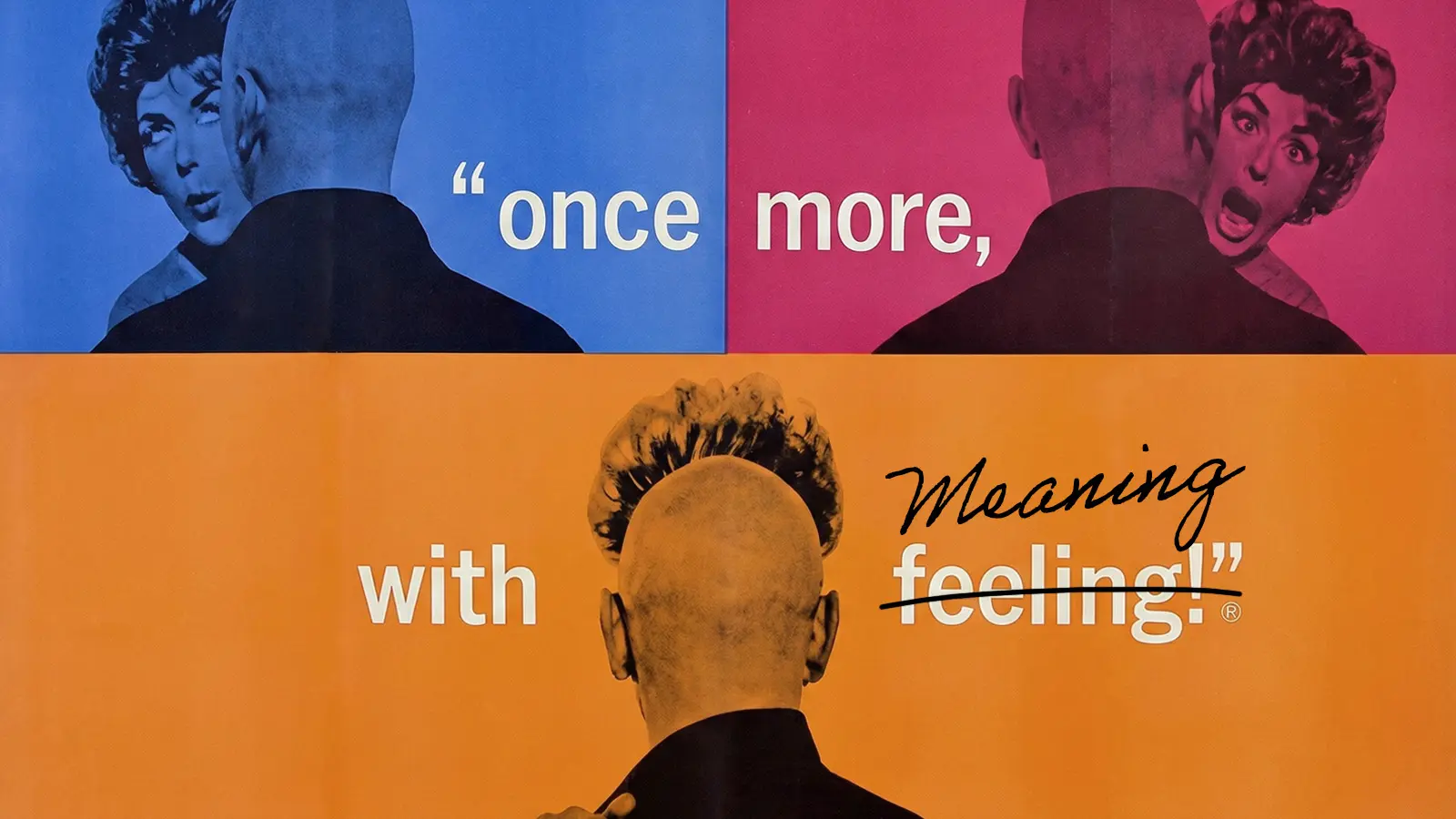
Beauty is showing you care
If the usability is good, do aesthetics still matter?
Aesthetics must go hand-in-hand with great usability, as they’re impacting users’ experience differently. Where usability focuses on the practicality of the product, aesthetics affect the emotions of the user and go the extra mile.
Don Norman argued similarly in his article, “Attractive things work better”. He discovered that attractive things make people feel good and that emotions change how the human cognitive system completes tasks. When faced with a problem, anxious people tend to narrow their thoughts compared to those in a positive emotional state, who think more freely and effectively in finding solutions, and as a result, are more tolerant of minor difficulties. Tense and anxious people will complain about them, whereas relaxed, happy ones will probably not even remember them.
Companies like Airbnb, Uber, Revolut, Rivian, and Stripe have prioritised design in their development. It is seen as a key differentiator, and it works. Now, the established companies (such as traditional banks) are starting to step up their design to compete with the newcomers.
Why is design such a priority for these companies? They understand that to introduce a new way to bank/travel/order delivery, it’s not enough to make the platform functional and easy to use. To stand out, they need to go the extra mile; rethink their layout, craft every illustration, and delight at every opportunity – just like a high-end hotel greets guests in its spotless, well-decorated grand lobby with smiles, hot towels, and cucumber water. Not only are the customers feeling calm and happy, but they also feel cared for and understood. These feelings address a fundamental human need and have a profound and enduring impact.
A clean and balanced page layout guides users. An engaging image excites users. Unexpected micro animations delight users. The right choice of fonts and colours establishes trust with users. All of this – and more – combined evokes feelings of joy, calm, or excitement, influencing the overall user experience. They evoke a positive emotional response, making customers feel understood and cared for, which motivates them to choose and continue using the product/brand.
Attractive and delightful design is not a nice-to-have. It’s showing that you care.
The impact of aesthetics
Now that we understand how aesthetics influence emotions, several product aspects would be impacted by this.
First impression and purchase decisions
Most people research their next purchase online and then maybe make a visit to the shop or showroom. This means that most people don’t actually use the product, and that’s why the first impression matters. As revealed by research published in PMC, design aesthetics have a significant influence on perceived product value and purchase decisions. Low design aesthetics attracted more attention than high design aesthetics did, and high design aesthetics triggered positive emotions and a higher perceived value.
Brand trust
A brand isn’t just about the logo and tagline, but everything customers see, hear, touch, feel, and smell wherever they experience the brand. From social media posts, store interactions, customer relations on the phone, and, of course, the product itself. Today, as we interact with digital interfaces almost at every moment, they have become an integral part of the brand's touchpoints. An attractive and on-brand aesthetic would create a stronger brand feel and trust.
Satisfaction, loyalty, and advocacy
As people spend more time digitally, their expectations of what is good and acceptable as an industry standard are increasing. Products that exceed users' needs and expectations become truly desirable and stand out above the competition. Additionally, positive experiences (as well as negative ones) are often shared with close friends and family, and even a wider online community. A delightful experience goes a long way.
Intuitiveness of the user experience
In 1995, researchers Masaaki Kurosu and Kaori Kashimura from Hitachi Design Centre conducted an experiment. They tested 26 ATM UI variations, asking 252 participants to rate ease of use and aesthetic appeal. They found that users are strongly influenced by interface aesthetics, regardless of functionality. This is known as the aesthetic-usability effect, where users perceive attractive products as more usable.
We trust that a product will perform effectively when it looks well-made, because if the company goes the extra mile to create something beautiful, they must have thoroughly considered everything else as well.
Can beauty be measured?
Plato believed that proportion, harmony, and unity constitute the beauty of things. Aristotle claimed that the universal elements of beauty are order, symmetry, and definiteness. A widely accepted definition of aesthetics is “the study of the feelings and judgments arising from our appreciation of objects considered moving, or beautiful, or sublime”. Although feelings and harmony could be considered abstract and subjective, there are ways to evaluate a product’s aesthetics.
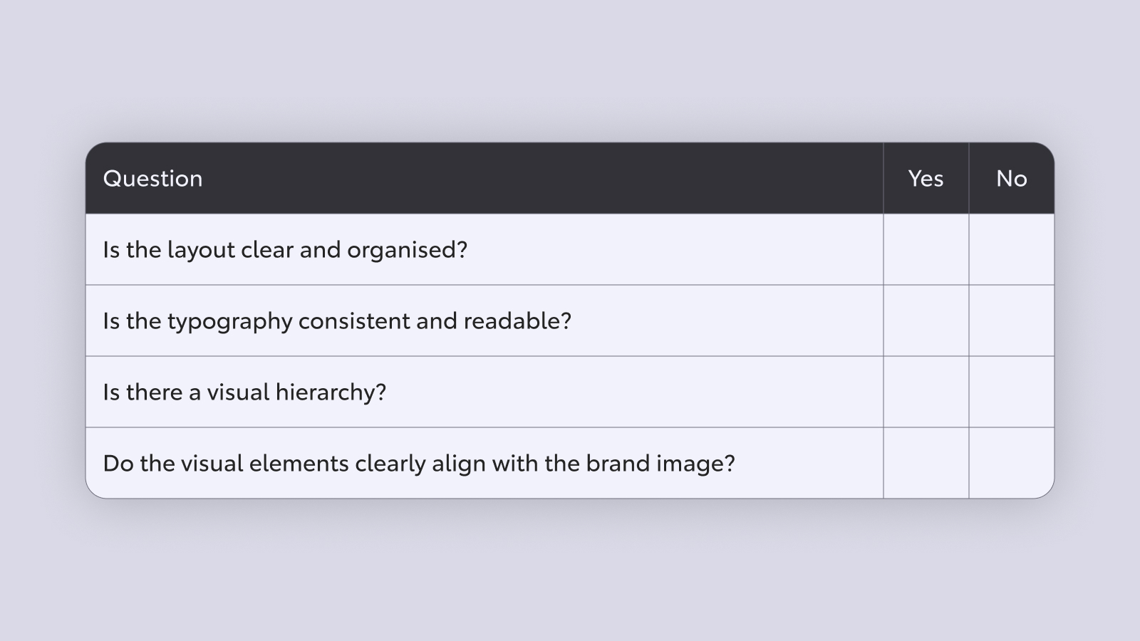
Checklist
A quick initial evaluation that might be done internally. Could be yes/no questions, such as:
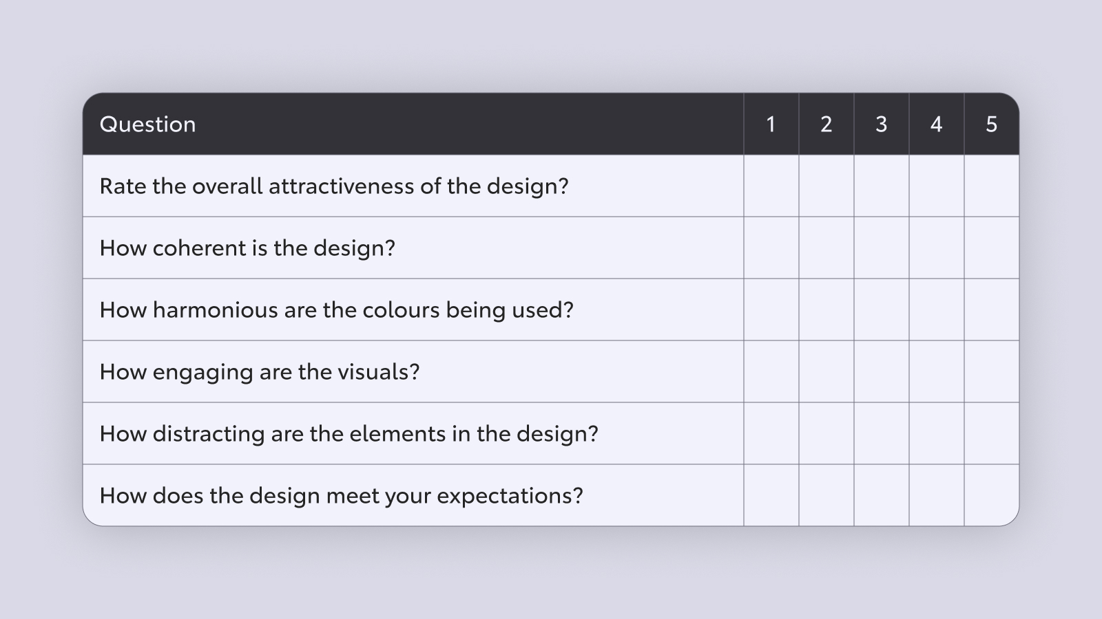
User survey (scale)
A quantitative survey to see where the design sits on a scale. Asking the user to give a rating (1-5) on questions, such as:
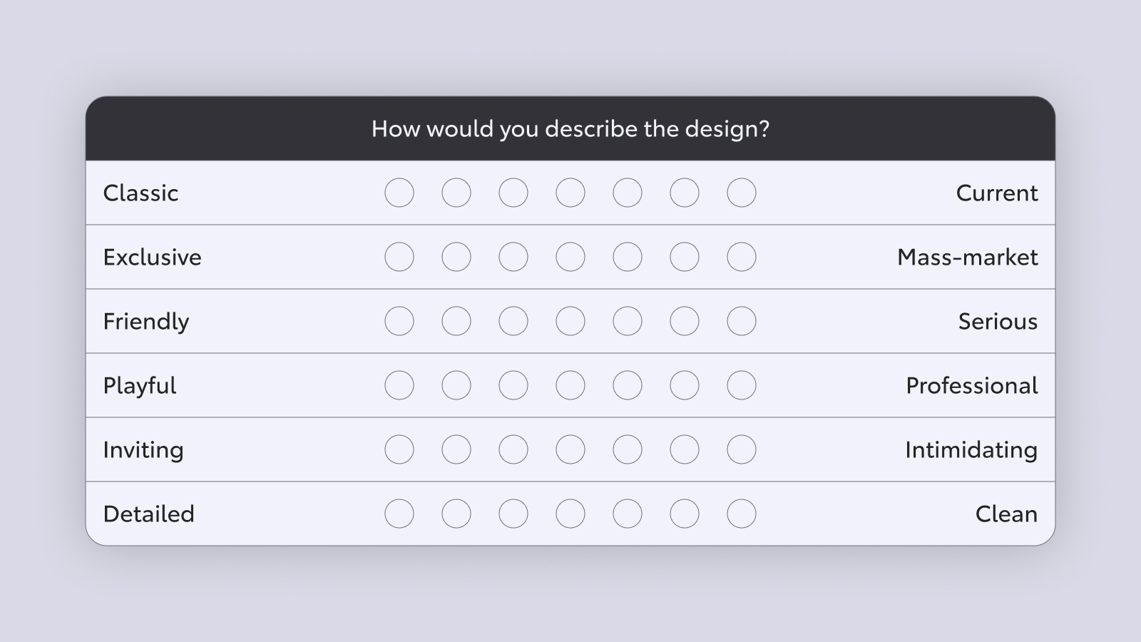
Bipolar Emotional Response Test (BERT)
A test that helps align interface designs with brand values by assessing emotional responses to design elements on two polar opposites on a scale, for example:
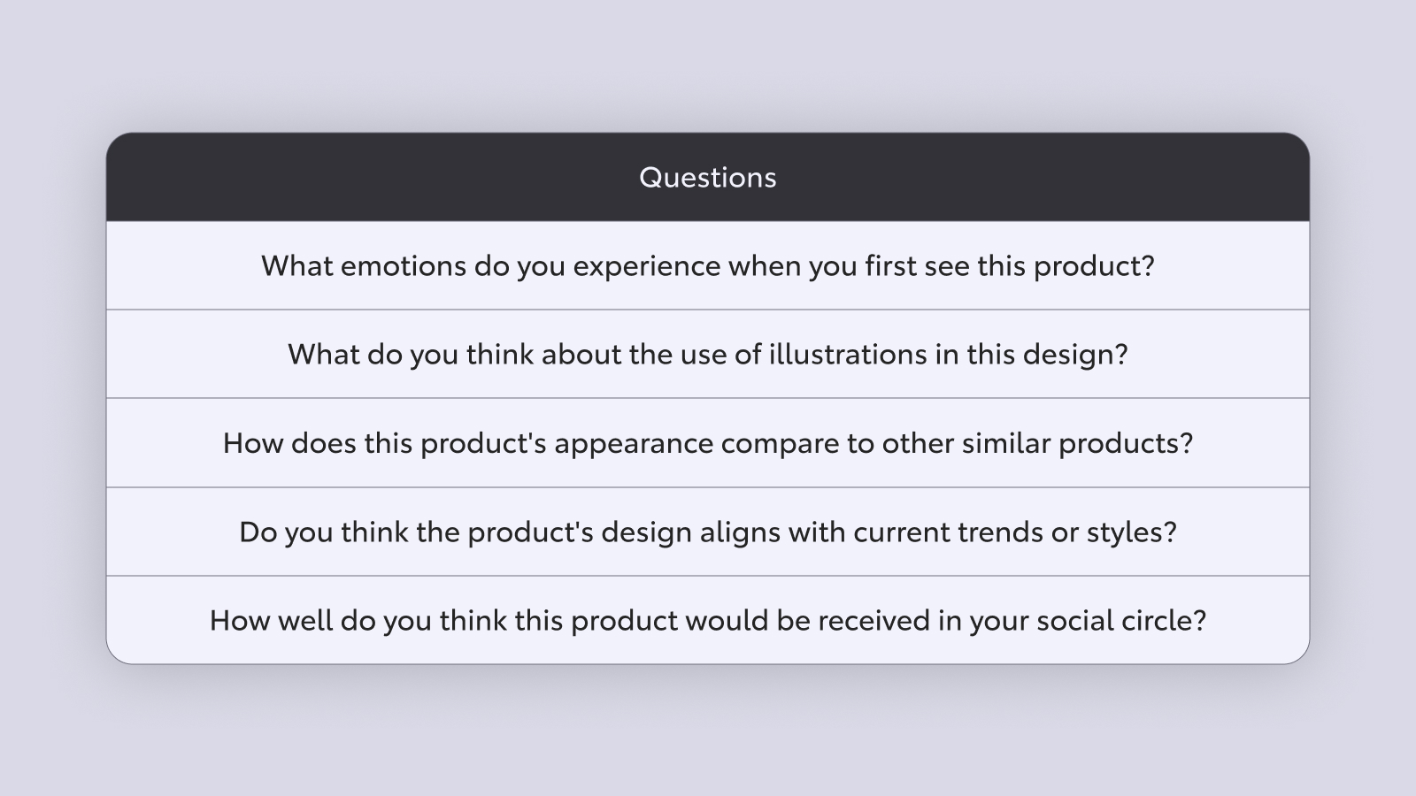
User interview and feedback
A qualitative evaluation of users’ perception of the design’s attractiveness. It could be in person or through a feedback form. With questions such as:
By employing a combination of these methods, you can gain an understanding of how attractive the product’s design is and continue improving for better aesthetics and user delight.
The rise of delightful infotainment systems and vehicle apps
Established OEMs are forced to improve their interface game as new EVs and new Chinese manufacturers have raised consumers’ expectations on how the infotainment system looks.

Based on the YouGov 2023 study, the infotainment system is one of the most important tech feature consumers are looking for in their new car, and a recent TCEU clinic discovered that the interface of the infotainment system is seen as a part of the vehicle’s interior. This sentiment is shared by the BMW Group, Tesla, and all the new contenders, particularly Chinese manufacturers, who have all invested heavily in crafting the best user experience as humanity spends most of its days on digital platforms.
Furthermore, Gen Z are quickly becoming the main customer demographic with purchasing power. As the first digital native generation, their expectations of the digital experience and trends are high.
With all of this in mind, it’s now more important than ever to invest in crafting the most beautiful and delightful experience for our customers.