
In the early days of mobile apps, success was often measured by metrics like daily active users or time spent in-app. The logic seemed sound: higher engagement equals better user experiences. But in the automotive industry, this approach fundamentally misunderstands how drivers actually want to interact with their vehicles' digital ecosystems.
The problem with app engagement metrics
A J.D. Power study found that 79% of Tesla drivers use the Tesla app each time they drive (up from 69% the previous year), but this high usage often stems from necessity rather than delight. Despite this frequent use, satisfaction still lags due to slow connections and inconsistent performance.
Similarly, the MyBMW app boasts over 13 million users globally with 2 million daily active users, yet still struggles with the same fundamental challenge: frequent usage driven by necessity rather than a seamless user experience design.
These two examples highlight how high engagement metrics can actually hide poor user experience.
Think thermostat, not TikTok
The best app experience might be the one you never have to open.
Think of it like a thermostat—the best one is set once and never thought about again because it just works.
Utility apps, such as insurance apps like GEICO (rated best overall mobile user experience among major carriers), succeed precisely because customers rarely need to open them. Users willingly pay premiums for apps they hope never to use actively, valuing peace of mind over screen time. Similarly, password managers, smart home apps, and backup services derive their value from invisible, background functionality rather than daily active engagement.
Automotive apps are, in many ways, utility apps. They exist to solve specific problems (unlock your car, check battery status, find your vehicle) rather than entertain or socially connect you. 43% of consumers would pay more for greater convenience, and users generally prefer designs that are fast and easy to use, but satisfaction isn't 100% correlated with objective usability metrics, like frequency of use.
Beyond the app screen is where the magic happens
The most effective automotive UX occurs at the edges of conventional app experiences.
Glancable information

Widgets provide at-a-glance information (EV battery levels, charging progress, or security status) right from your home screen. The demand for this instant access is clear: there were 3.8 million installs of homescreen widget apps by iPhone users in the United States during just one week in 2020, demonstrating users' strong preference for immediate information without app launches.
Live Activities (iOS)/Live Updates (Android) let you monitor charging completion times directly from your lock screen, eliminating the need to repeatedly open apps.
Quick control

Control Centre quick actions enable remote lock/unlock or honking without navigating through full app interfaces.
iOS Shortcuts and Action Buttons enable one-tap or voice-triggered car functions, for example, you can create a shortcut to "Start My Car" that pre-conditions, unlocks, and starts navigation with a single press of the iPhone's Action Button, completely bypassing app navigation.
Voice assistants (Siri, Alexa, Google) let you say "Lock my car" and move on with your life.
Proactive personalisation

Smart scheduling learns your patterns and proactively prepares your vehicle, such as the MyBMW app, sending "Time to Leave" notifications and enabling pre-conditioning without requiring you to remember or actively engage.
Proactive notifications deliver important information before you need it, alerting you to potential issues, such as heavy traffic delays, low tyre pressure, or scheduled maintenance that is due, preventing problems rather than reacting to them.
Contextual navigation surface relevant information contextually, not on demand, showing charging station availability when your EV battery is low, or automatically displaying parking options as you approach your destination, without you having to open specific apps.
Real metrics that matter
Instead of measuring app opens or session duration, automotive UX should be evaluated by:
- Friction reduction: How many steps did we eliminate from routine tasks?
- Proactive value: How often did we solve problems before users knew they existed?
- Invisible reliability: How consistently do background functions work without user intervention?
- Peace of mind: How confident do users feel about their vehicle's status throughout the day?
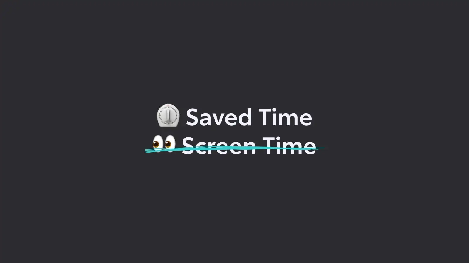
As designers, our goal isn't screen time. It's car time, life time, saved time.
We need to reframe how we approach automotive digital experiences. We're not just designing apps, we're designing systems that anticipate needs, provide ambient awareness, and disappear into the background of people's lives.
The most successful automotive UX will be the one users barely notice, because it's working so seamlessly that conscious interaction becomes unnecessary. In a world where every app fights for attention, the automotive industry has the opportunity to give users something more valuable: the gift of not having to think about their car at all.